
Bitcoin faces another pressure point as one chart shows repeated post FOMC selloffs, while another points to a lower liquidity cluster that could pull price down. Together, the setups suggest macro pressure and leverage positioning are shaping the next Bitcoin move.
Bitcoin Charts Show FOMC Linked Selloffs Could Pressure BTC in 2026
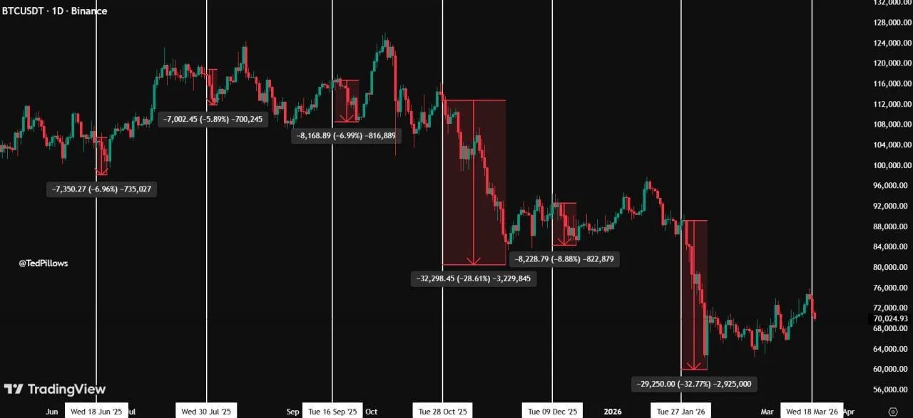
Bitcoin has fallen between 6% and 30% after each of the last six Federal Open Market Committee meetings, according to a chart shared by analyst Ted Pillows. The chart tracks several sharp pullbacks across mid 2025 to early 2026 and shows that post FOMC weakness has become a repeated pattern. Based on that structure, the analyst said another 6% decline would place Bitcoin near $67,000, while a deeper 30% drop could push it toward $50,000 in 2026.
Bitcoin FOMC Drop Comparison: Source: Ted Pillow
The chart highlights multiple corrections clustered around FOMC dates, with smaller declines near 6% to 9% and two much steeper drops above 28%. That pattern suggests macro events have continued to shape short term Bitcoin price action. In AP style terms, the chart does not confirm that the same move will happen again. However, it does show that traders have repeatedly reduced risk around Fed decisions, especially when broader market sentiment weakened.
Still, the chart presents those levels as scenario targets rather than confirmed outcomes. A move toward $67,000 would match the lower end of recent FOMC driven declines, while a fall to $50,000 would reflect a much larger risk off event. As a result, the chart frames 2026 as a period where Bitcoin may remain highly sensitive to Fed policy signals and broader market reactions.
Bitcoin Liquidation Heatmap Shows Liquidity Cluster Acting as Price Magnet
The Bitcoin liquidation heatmap highlights a dense liquidity cluster forming in the lower range, where high leverage positions are concentrated. This type of structure often acts as a magnet because price tends to move toward areas with large pools of liquidation levels. The chart shows repeated interactions with similar zones in the past, where price moved into these regions before stabilizing or reversing.

Bitcoin Liquidation Heatmap: Source: CoinGlass
At the same time, earlier highlighted zones near local highs show how liquidity built up above price before sharp rejections followed. That pattern reflects how leveraged positions can drive volatility in both directions. When liquidity stacks above, price may push upward to trigger liquidations. However, once those positions clear, the market often shifts and moves toward the next liquidity pocket.
Now, the focus shifts to the lower highlighted band, where a larger concentration of liquidation levels remains. This suggests that downside pressure can continue until that liquidity gets cleared. As a result, the chart frames the current structure as a liquidity driven setup rather than a purely trend driven move, with price reacting to where leverage is most concentrated.
